WHITE RHINO
DESIGN DIMENSIONS FOR WHITE RHINO BREWING CO.
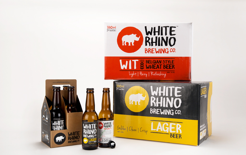

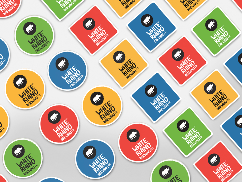
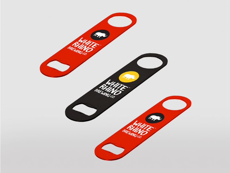
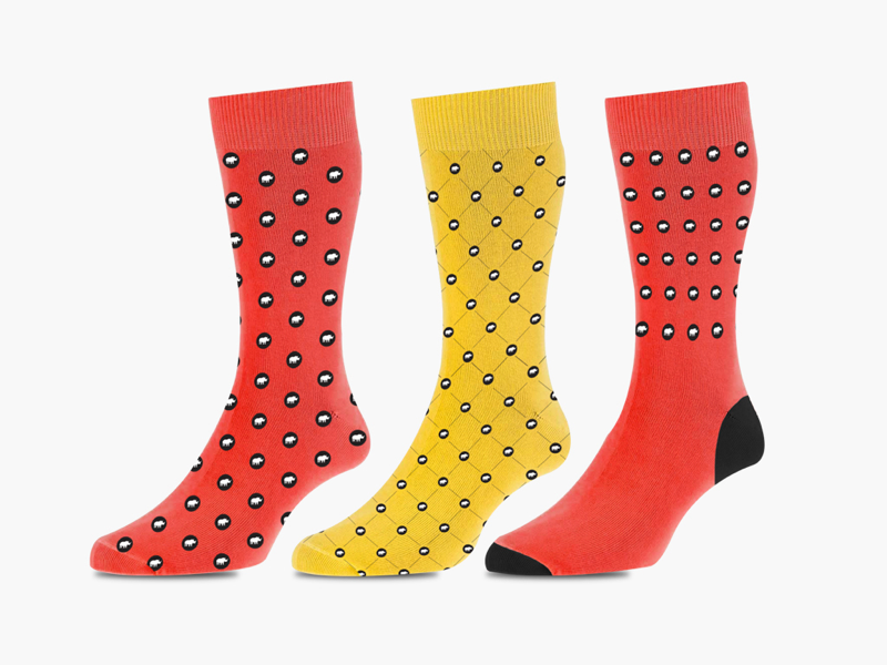
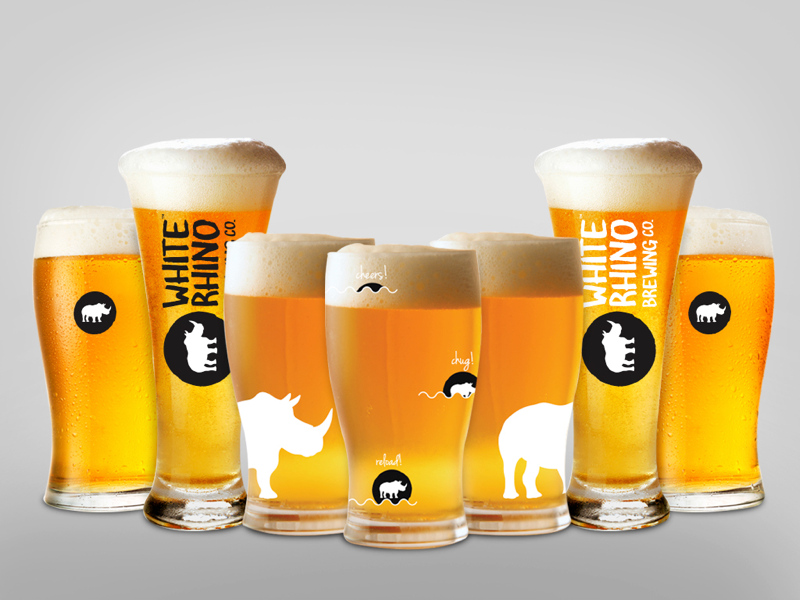
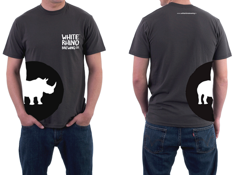
A recent entrant into the Indian craft beers – White Rhino Brewing Co. was launched with the intention of crafting a wide range of eclectic brews. A rare taste that’s hard to find anywhere else, just like its namesake. The designs were crafted to communicate this vision to reality.
Until now, existing breweries have either been too small to distribute or too large to focus on flavour, leaving beer fanatics with the only alternative of opting for imported beers that are often stale. White Rhino Brewing Co. was conceived with the objective of bringing together the best ingredients, equipment and people to brew world-class craft beer right here in the heart of the country delivering kegs and bottled ales to pubs and retail outlets across geographies.
BIG IDEA
Create the perception of rare taste crafted by experienced brewers that’s hard to find anywhere else, just like its namesake.
Year
2016Client
White Rhino Brewing Co.Services
Brand Identity, Design, Packaging, MerchandisePapadmalji
DESIGNED BY DESIGN DIMENSION
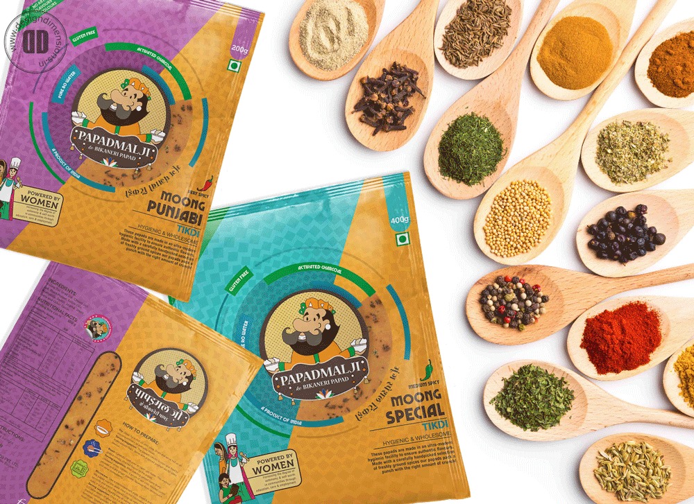
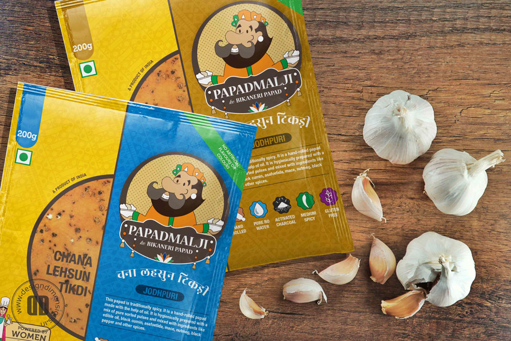
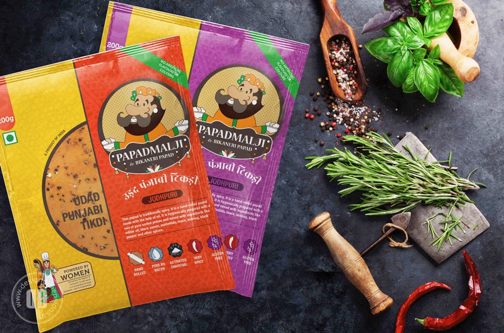
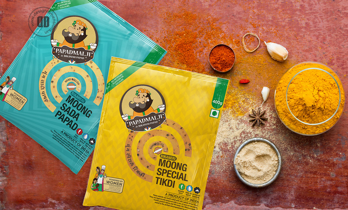
What started as a papad tale has grown and become more of an epic. As one of the most overlooked items in our dining eco-system, papad is still an essential component of every Indian meal and has been for generations. The objective of this project was to bring papad the glory it deserves. Vishal Papad already had an extensive range of products, however the new company – Papadmalji needed a well curated list of products that would be sold through modern retail. We divided the products into three categories – Bikaneri, Jodhpuri and Modern with bold and vibrant packaging to be able to stand out gloriously on the shelves. The three ranges are differentiated through patterns, colours and processes. The youthful and vibrant vibe created during the initial stages of the branding remains with the addition of patterns and characteristics for each type of papad.
The mascot was modified to create a new logo for Papadmalji’s brand new company with the option of bilingual branding – in English and Hindi across all kinds of packaging. To go one step further, we localised the logo for different parts of the country to make the brand more approachable and accessible – we’ve done versions in Bengali, Gujarati, Malayalam, Punjabi and Urdu.
This entire packaging exercise has been to reinstate papad as the one-true-king of every Indian household. Love makes the world go round and the love with which Papadmalji’s papad is made; definitely makes our world go round.
BIG IDEA
Reignite the glory of the most common pairing of Indian meals – The Papad through a bold and vibrant design for distinction on shelf.

Year
2018Client
Vishal PapadsServices
Logo Design, Brand Identity, Packaging

Le Marche
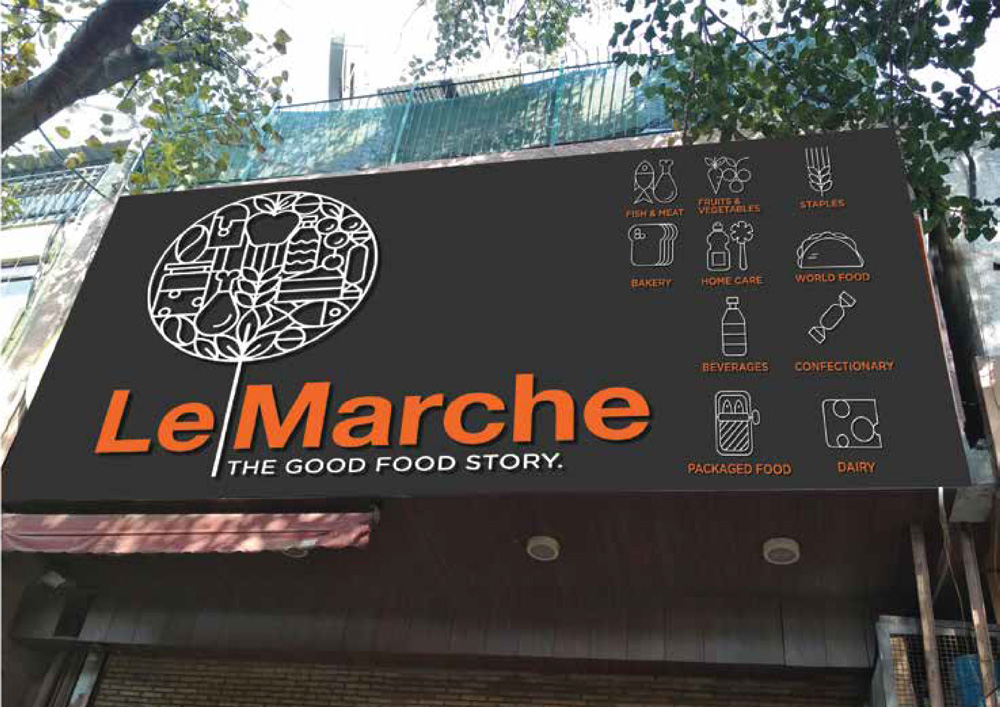
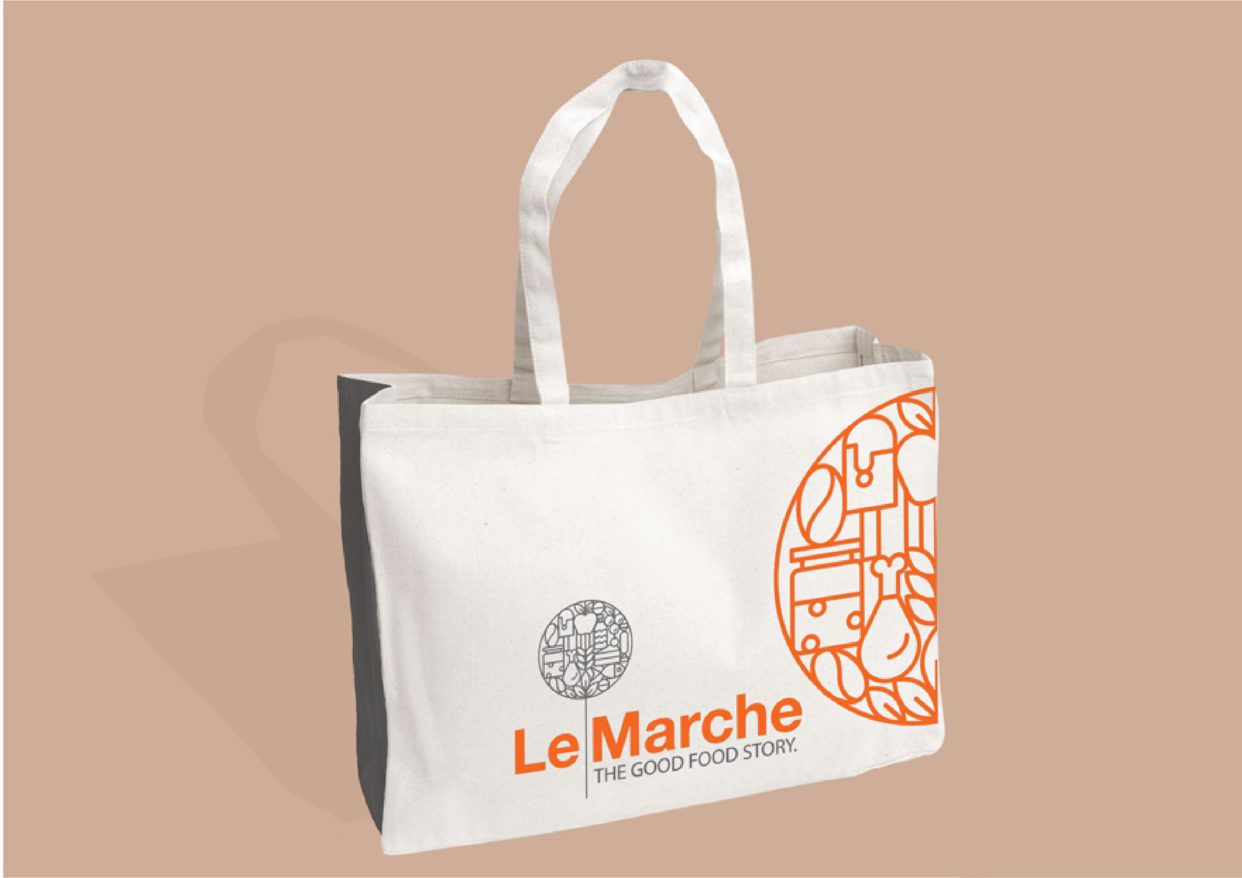
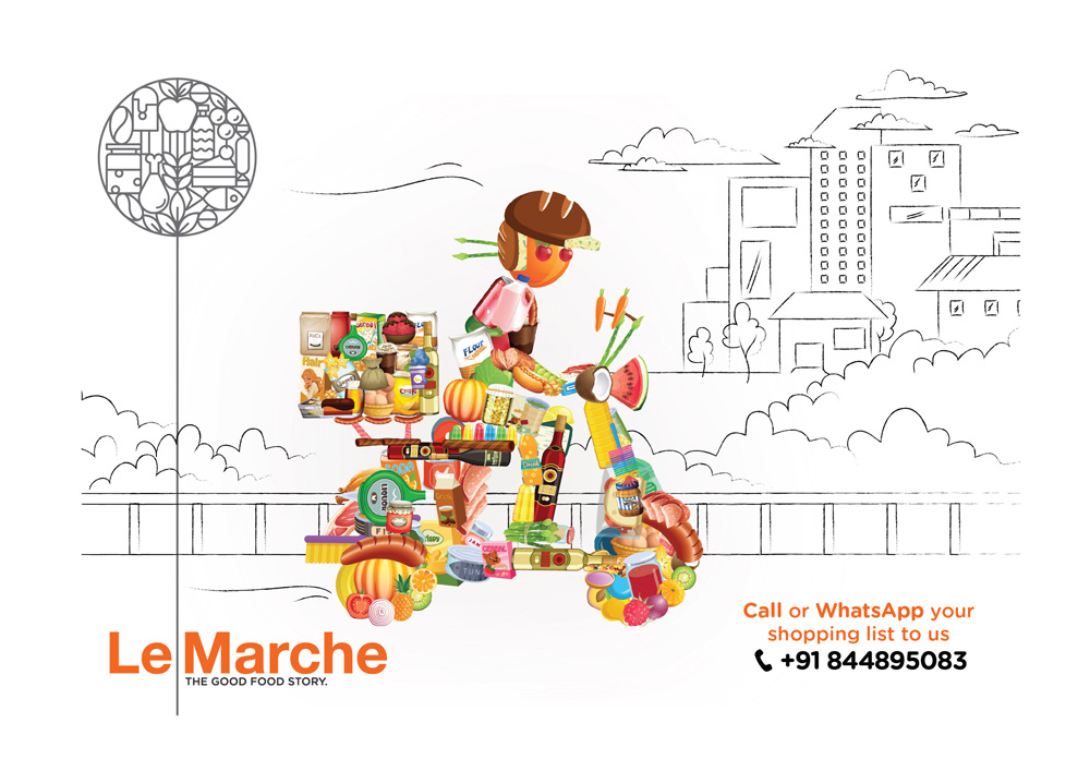
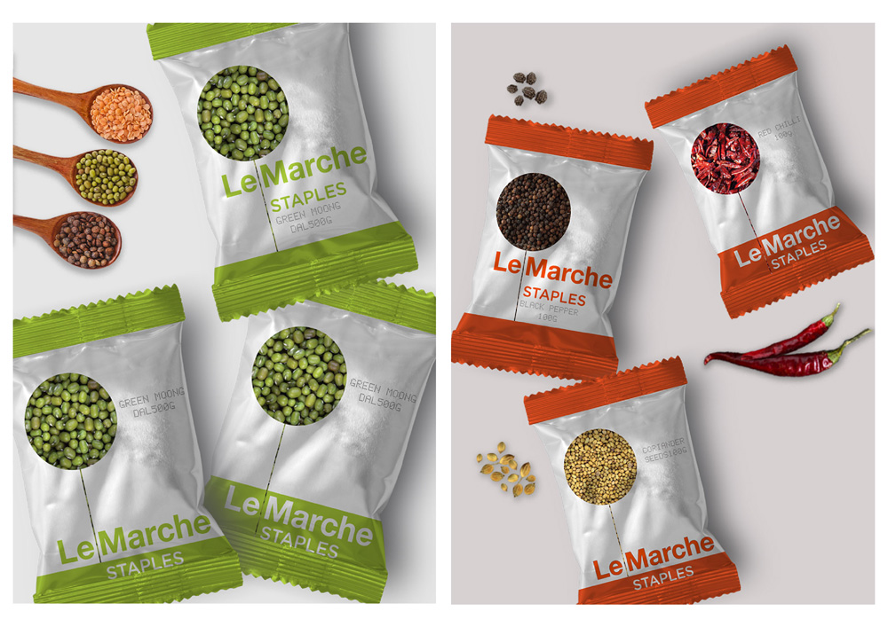


Refresh Brand Identity for Le Marche
DESIGNED BY Design Dimensions
Le Marche has been a well-known brand for keeping quality products and being one of the first gourmet retail stores in the Delhi NCR region. With the recent buyout of the brand by DS group in 2017 – it was time to change the look and feel; to revamp the logo and bring in fresh energy.
Le Marche needed to be a place where new ideas are put together in a bid to enhance the shopping experience. The focus of a concept store is differentiation through display: mixing products that one might not see in the same department of a store and creating a story. The aim was to project a sense of community, friendship, love and unity.
Year
2017Client Name
DS GroupServices
Brand Identity, Illustration, Space Branding, Packaging, RetailDELISHH POP DROP
DESIGNED BY DESIGN DIMENSIONS
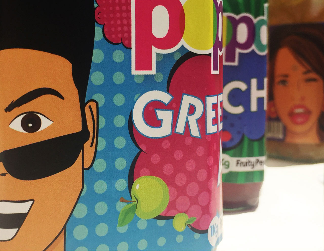
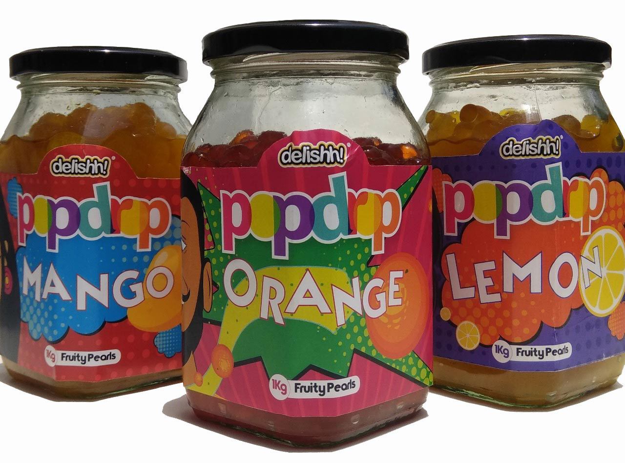
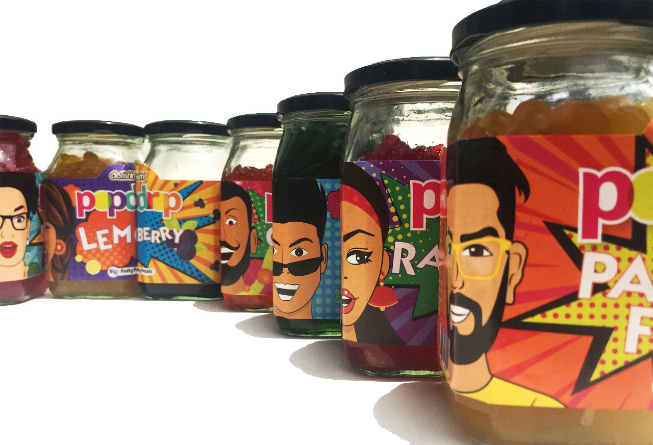
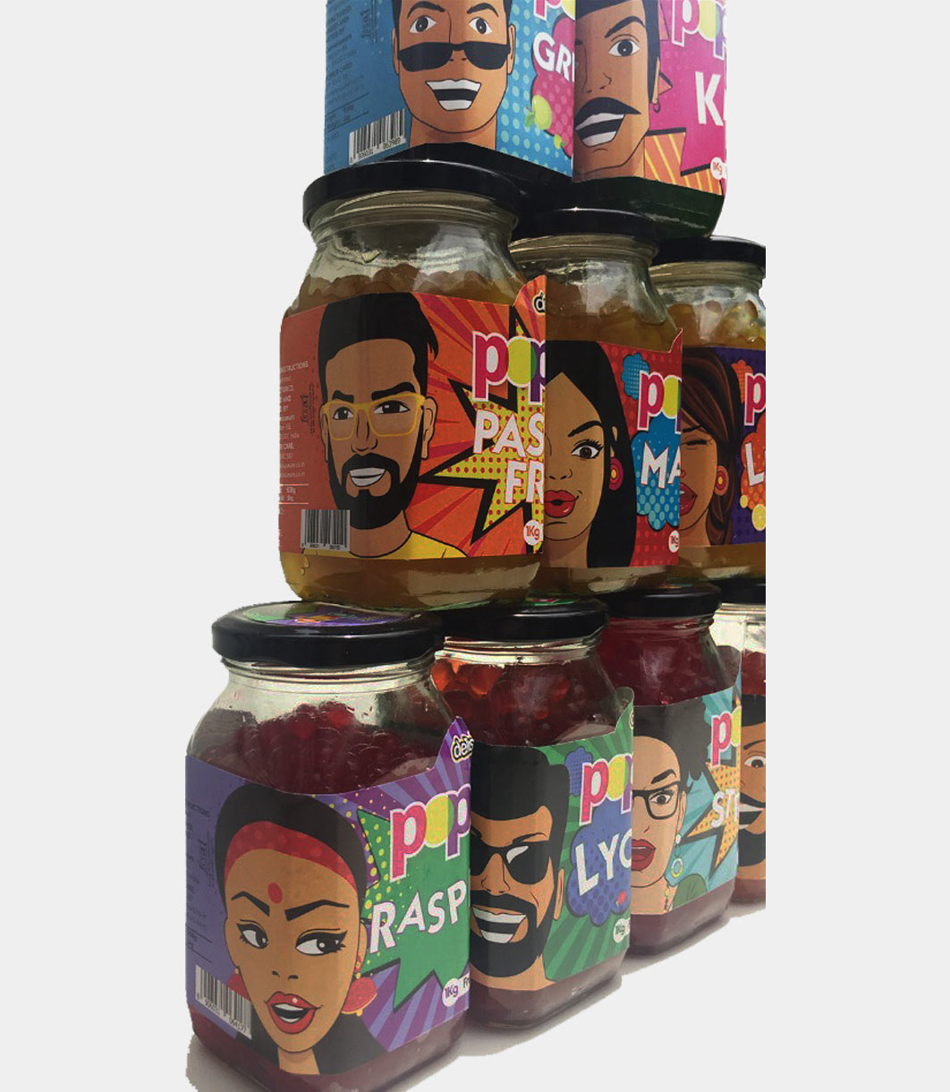
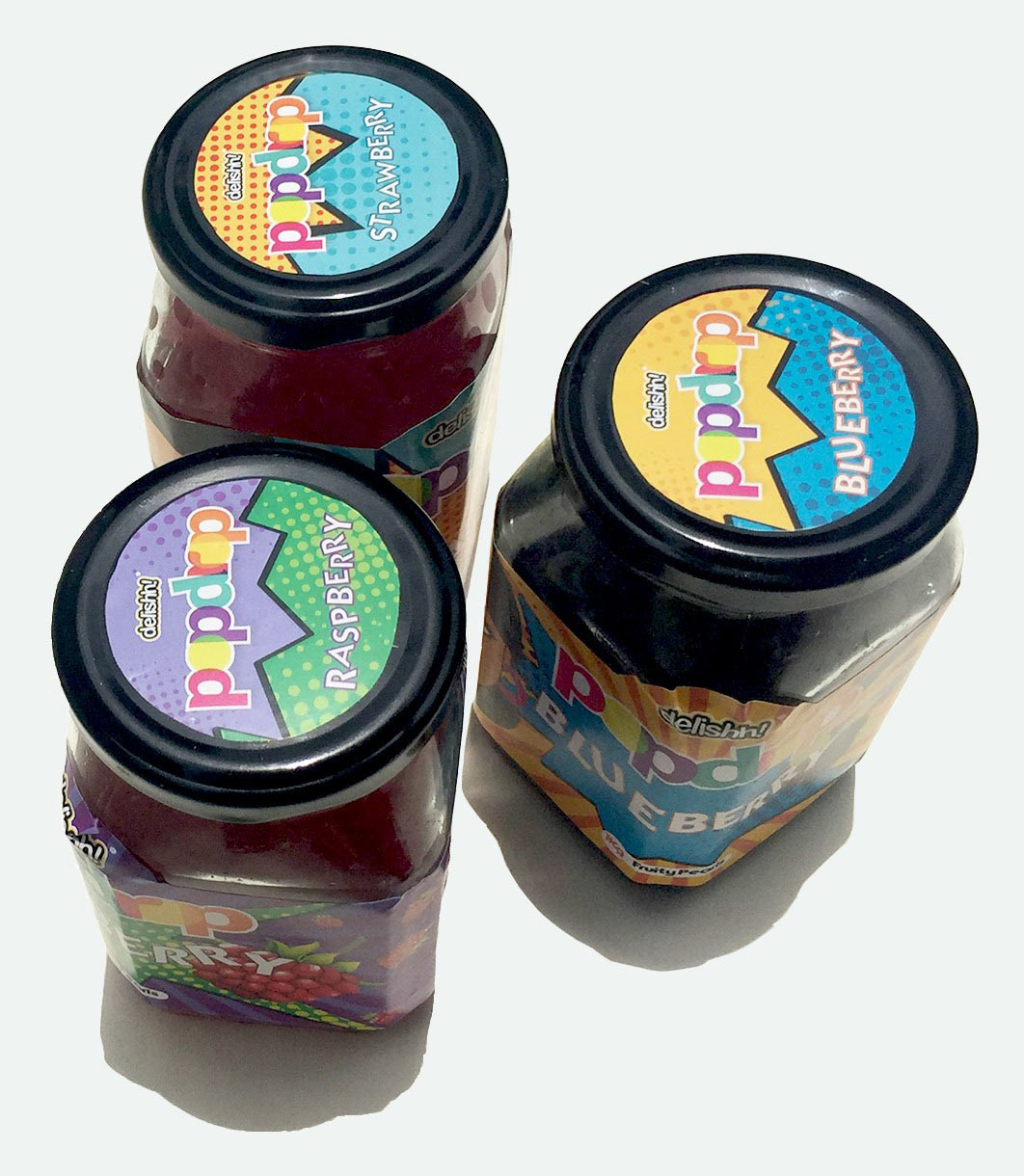
The brief was to create a strategic brand name that would help identify the product immediately. After a lot of market research, product segmentation and days of ideation we finalised POPDROP as the brand name. These fruity pearls have a thin, gel-like skin with juice inside that bursts on your tongue. It comes in 10 exciting flavours and is complementary to bubble tea and frozen yogurt.
The next step was creating the logo for popdrop. Considering the nature of the product it had to be colourful and fun and the final iteration is exactly how we visualised it. We’ve used a bold font with bright colours. Something that would stand proud under delishh!
We used a retro pop art style for the labels to emphasise on the vibrant and youthful nature of the products. We created characters for each of the labels based on retro characters from the 1970’s. Creating a distinct Indian-ness in each of the characters was the most challenging and fun part of the design process.
BIG IDEA
Leveraging retro pop art style packaging to drive the vibrant and youthful nature of the products.